
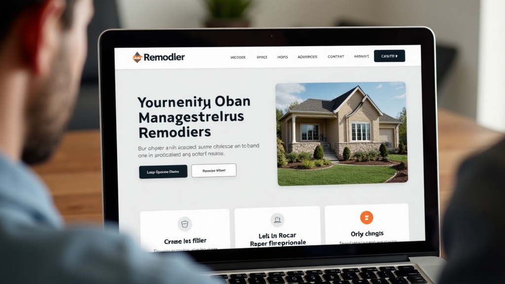
What Should Be Above the Fold on a Remodeling Website?
Build the first screen of your remodeling website around project fit, location, trust, proof, and a clear next step.
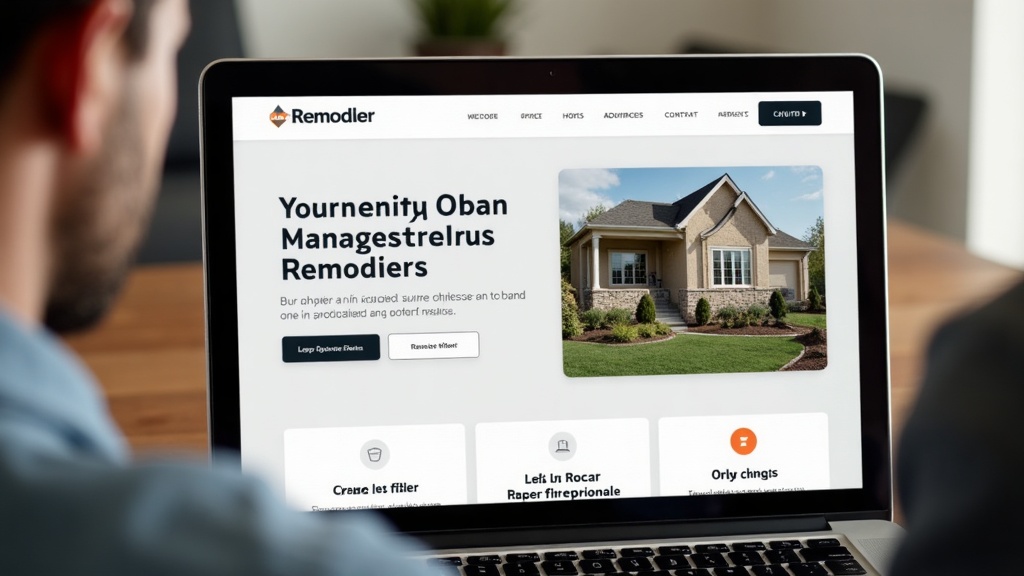
A homeowner decides whether your remodeling website feels credible before they finish the first screen.
Above the fold, your site should answer five questions fast: who you help, what you do, where you work, why the homeowner should trust you, and what the next step is.
Here’s what that means for your outfit: the hero section is not a billboard for a clever slogan. It is the first sales conversation. If it wastes that moment, every service page and project photo below has to work harder.
Good website design for remodelers is not about cramming everything at the top. It is about showing fit, proof, and next step without making the page feel crowded.
Why the first screen matters
The first screen sets the trust baseline. A homeowner who is considering a kitchen, bath, basement, addition, or whole-home remodel is already trying to reduce risk. Your first screen either helps or adds friction.
A weak hero section creates doubt. “Quality craftsmanship you can trust” could belong to any contractor. A cold stock photo does not prove your process. A CTA buried under a slider does not help your pipeline.
Clarity
The homeowner should understand what you do without scrolling.
Location
The service area should be visible enough that local fit is obvious.
Proof
The photo and trust signals should support real remodeling work.
Next step
The CTA should make it clear what to do when the project is serious.
I keep seeing remodeler homepages where the first screen looks like a furniture ad. Pretty, sure. But it does not tell the homeowner whether the outfit can handle the scope, schedule, or bid they are about to ask for.
The five questions it should answer
Your remodeling website hero section needs to answer five questions before the homeowner scrolls.
- Who do you help? Homeowners, design-build clients, older homes, growing families, luxury kitchen clients, basement finish buyers, or another clear audience.
- What do you remodel? Name the core services. Do not hide behind “residential construction” if you want kitchen, bath, basement, addition, or whole-home work.
- Where do you work? City, region, or service area should be visible without overloading the headline.
- Why should I trust you? Use a short proof point: project type, process, reviews, portfolio, or specialty. Do not invent credentials.
- What should I do next? Call, request a project review, book a consultation, or explore services. Make one primary action obvious.
This is where messaging and positioning matters. If the message is vague, the design cannot save it.
What photos should show
The hero photo should prove the kind of work you want. If you want larger kitchen remodels, do not lead with a tiny powder bath. If you want design-build additions, do not lead with a cropped countertop detail.
- A real finished project that matches the type of work you want more of.
- Warm, natural light and a lived-in sense of scale.
- Enough context to understand the room, not just a close-up detail.
- A level of finish that matches the bid size you want.
- A style that fits your actual clients, not a stock-photo fantasy.
- No generic handshakes, suits, or cold showroom images.
Your branding should support the photo, not compete with it. The first screen should feel like your outfit, not like a template made for any business.
What proof belongs near the top
Proof near the top should reduce risk. Keep it short. The full story can live lower on the page.
Project type proof
Mention the services you handle and show a matching photo.
Local proof
Name the service area or region clearly.
Process proof
Use one line about planning, communication, or jobsite care.
Review proof
A short review snippet can work if it supports trust and not just praise.
Portfolio path
Give homeowners a way to see more project proof without hunting.
CTA proof
The CTA should match the buying stage. “Talk through your project” feels different from a hard sell.
The hero should connect naturally to website content and blog strategy. A good first screen starts the conversation. The rest of the site answers the questions.
What Bradd would remove
Most first screens need subtraction before redesign. Clutter makes the homeowner work harder.
- Rotating sliders that hide the message and slow down clarity.
- Vague headlines like “Building dreams” or “Quality you can trust.”
- Generic stock imagery that does not show your work.
- Three competing CTAs in the same hero area.
- Tiny phone numbers or buttons that are hard to tap on mobile.
- Paragraphs of copy before the homeowner knows what you do.
- Award badges, logos, or icons that crowd the page without explaining trust.
Good design and development makes the first screen feel simple because the hard decisions already happened behind the scenes.
I would rebuild the hero section around one clear line, one real project photo, one trust cue, one service-area cue, and one next step. That is enough to stop making the homeowner guess.
Frequently asked questions
What does above the fold mean on a remodeling website?
Above the fold means the first visible screen before a visitor scrolls. On a remodeler website, it should quickly explain what you do, where you work, why to trust you, and what to do next.
What should a remodeler homepage hero section include?
Include a clear headline, service fit, local context, real project photo, short proof point, and one primary CTA.
Should I put a phone number above the fold?
Yes, if calls are a real conversion path for your outfit. Make it easy to tap on mobile and pair it with a clear project-fit message.
Are sliders good for remodeler websites?
Usually not. Sliders often dilute the message and hide the strongest proof. One clear photo and headline usually work harder.
What kind of photo should be in the hero section?
Use a real project photo that matches the work you want more of. Avoid generic stock images or overly staged visuals that do not reflect your clients.
How much copy should be above the fold?
Use enough copy to answer fit quickly: a clear headline, short supporting sentence, proof cue, and next step. Save deeper details for lower sections.
Your website should be your best salesperson. If it isn’t, I know why — and I can fix it.
If the first screen of your website makes homeowners guess, something is off. Call me for a real look at your situation, and I’ll show you what I’d change before touching the rest of the site.