
Website and content / Design and development
Build a remodeler website that works on the job, not just launch day
A high-converting website is not a desktop comp with a contact form attached. It is a fast, accessible, mobile-first sales path that your team can edit, your search work can grow, and a homeowner can understand while standing in a half-finished kitchen.
390 pxIf the page fails at a common phone width, the large-screen version does not rescue the inquiry.
The hard truth
Good remodeling work can still be invisible, unclear, or hard to choose
Mobile
The important proof falls below friction.
Huge images, tiny buttons, long menus, and decorative motion make the homeowner work before seeing fit, trust, or a next step.
Performance
The page looks polished and loads slowly.
Oversized images, stacked plugins, font weight, and third-party scripts turn every visit into a patience test.
Ownership
Simple updates require a developer.
The team delays new projects and reviews because page patterns are brittle, undocumented, or trapped inside one builder.
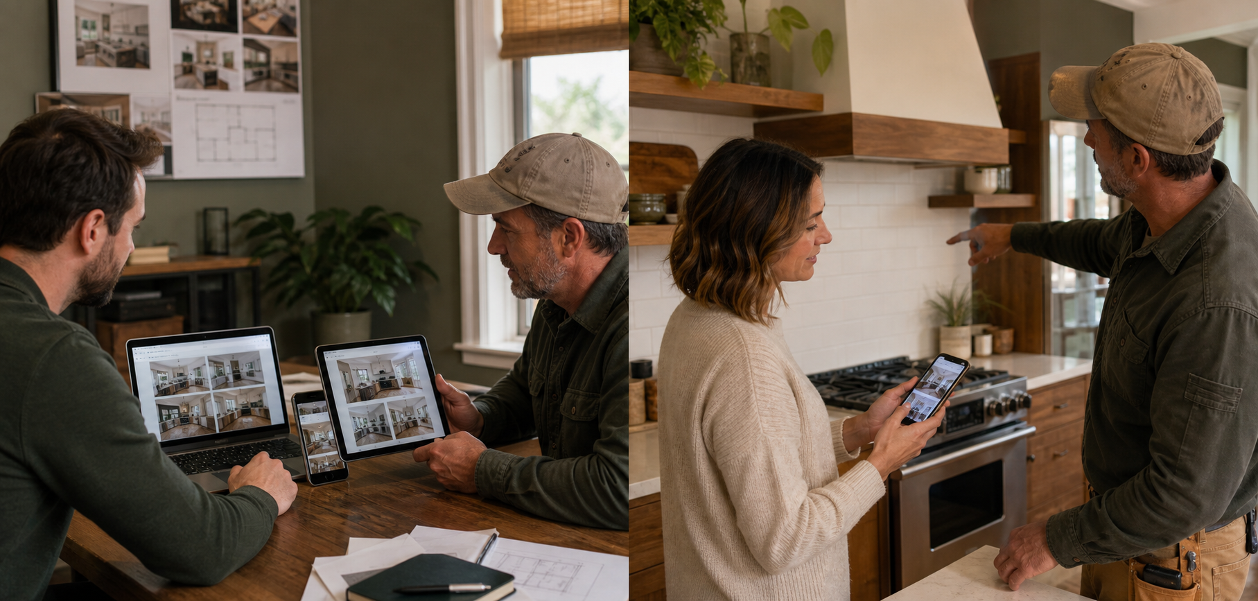
The same sales story should remain clear, fast, and usable from a phone to a large screen.
What the system needs
The technical foundation behind the sales story
Development choices shape speed, accessibility, search visibility, editing, measurement, and long-term cost. I keep the stack as simple as the requirements allow and build repeatable blocks around the pages the business updates most.
- Responsive system: fluid type, flexible grids, deliberate crops, touch-friendly controls, and meaningful breakpoints.
- Performance: efficient images, restrained scripts, stable layouts, sensible fonts, caching, and measured third-party tools.
- Accessibility: semantic headings, keyboard access, focus states, labels, contrast, alt text, and reduced-motion support.
- WordPress editing: normal blocks, reusable patterns, guarded styles, clean media practices, and short team instructions.
- Measurement: form success, call clicks, key page paths, campaign tags, privacy-aware analytics, and source capture.
How the work moves
A build sequence that reduces launch surprises
The site is tested while it is being built, not after every page is filled. Real content, real image proportions, and real forms surface layout and performance problems much earlier than placeholder copy.
Prototype
Build the page system around the hardest templates, mobile behavior, forms, content types, navigation, and editing workflow.
Develop
Create the responsive blocks, styles, templates, integrations, tracking, redirects, schema, and content-entry rules.
Verify
Test browsers, phones, tablets, keyboard paths, forms, calls, speed, image crops, search metadata, and error states.
Launch and watch
Back up, deploy, inspect indexing and analytics, monitor errors, and repair the first real-world friction quickly.
Real proof, useful context, and a clear next step beat decorative marketing.
Here is the pattern I keep seeing: a remodeler pays for a redesign, then the first new project gallery breaks the layout because the delivered system only worked with perfectly cropped demo images. Real editing is part of development.
The business outcome
A website should get easier to own over time
The best launch hands the team more control, not another dependency. Projects, reviews, people, FAQs, and resource content should have repeatable patterns with enough guardrails to stay consistent. The site can still be custom without making routine updates custom work.
I also plan for failure: an image that is too tall, a heading that wraps, a missing testimonial, a slow form response, or a long service name. Exceptional responsive work is less about one perfect screenshot and more about how gracefully the system handles imperfect content.
Handoff check: Before launch, I ask someone who did not build the site to replace an image, edit a headline, add a project, update a testimonial, and review the page on a phone. The exercise exposes unclear patterns, fragile formatting, and missing instructions while the development context is still fresh enough to fix them properly. I record the successful steps in a short operating guide the team can return to later. That guide also names the few changes that should come back to a developer instead of being improvised inside a live page.
Keep building the system: Website and content · Blog strategy
Questions remodelers ask
Straight answers before you invest
Can WordPress be fast?
Yes. Hosting, theme architecture, media handling, plugins, scripts, and page discipline matter more than the platform name by itself.
Will the blocks stay editable?
Yes. I favor native WordPress blocks and documented patterns so text, images, lists, columns, and calls to action remain individually editable.
What happens after launch?
A short stabilization period should cover errors, indexing, forms, tracking, performance, and team questions, followed by a clear maintenance owner and update rhythm.
Is the site built for the next update?
Call me, or book a 30-minute technical review. I will look at mobile friction, speed, editing, and the path from page visit to qualified inquiry.