
Branding / Logo and visual systems
A remodeler logo has to work harder than it looks
A logo may appear on a 60-pixel phone header, a 12-foot trailer, an embroidered shirt, a proposal, and a yard sign. If it only looks good in a presentation, it is not finished. I build a visual identity that stays recognizable, legible, and credible wherever homeowners meet your outfit.
1 systemPrimary mark, secondary lockup, icon, type, color, imagery, and real-world rules should operate as one family.
The hard truth
Good remodeling work can still be invisible, unclear, or hard to choose
Recognition
The mark disappears at small sizes.
Thin details, long taglines, and complex rooflines collapse on a phone, shirt, social avatar, or truck seen across the street.
Distinctiveness
It looks like every contractor in town.
Another hammer, house, or roof silhouette may describe the category without giving a homeowner anything memorable.
Usability
The team has one low-resolution file.
Vendors redraw it, colors shift, spacing changes, and each new application becomes slower and more expensive.
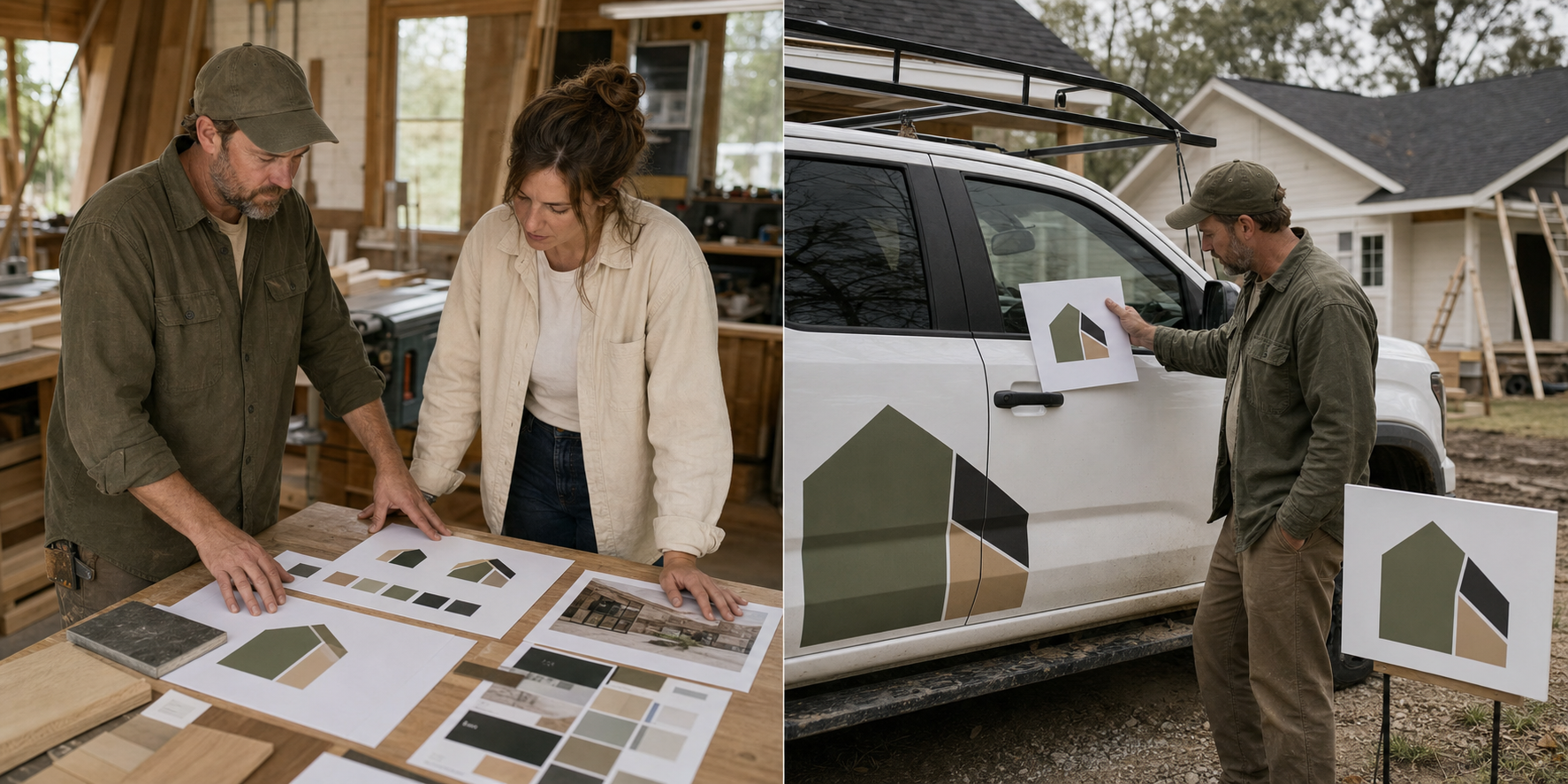
The identity earns its keep when the same idea survives every real remodeling application.
What the system needs
What belongs in a field-ready visual identity
The logo is the center, not the whole system. I build enough flexibility for a website header, vertical job sign, square social crop, vehicle door, document cover, and team apparel without inventing a new look each time.
- Core marks: primary logo, compact lockup, icon or monogram, wordmark, and light and dark versions.
- Typography: a practical hierarchy for headlines, body copy, captions, proposals, and web interfaces.
- Color: primary, supporting, and accessibility-tested combinations with print and digital specifications.
- Image direction: guidance for job sites, finished rooms, people, before-and-afters, crops, and editing.
- Production files: vector, print, web, social, and vendor-ready formats with names a normal team can understand.
How the work moves
From business character to usable files
I start with what the company needs to signal – not a favorite color or a trend board. A design-build firm moving upmarket, a kitchen specialist known for care, and a newer owner-operator need different visual cues.
Audit the context
Review the current mark, competitors, vehicles, signs, proposals, website, target work, name recognition, and production constraints.
Explore directions
Develop two or three distinct routes with a reason behind the shape, type, color, tone, and application behavior.
Stress-test the route
Test the chosen direction small, large, one-color, reversed, embroidered, wrapped, printed, and placed beside real project photography.
Package the system
Deliver organized files, usage rules, templates, and a rollout list that replaces the most visible old assets first.
Real proof, useful context, and a clear next step beat decorative marketing.
Here is the pattern I keep seeing: the owner asks for a more premium logo, but the truck still needs to be readable at 35 miles per hour. Premium is not fragile. The strongest route usually gets simpler, bolder, and easier to repeat.
The business outcome
The goal is recognition without explanation
A useful identity makes the company easier to recognize and easier to manage. The website, proposal, job sign, uniform, and social post feel related before anyone studies the details. That consistency supports trust because it suggests the operation behind the brand is equally organized.
Original does not mean strange. The mark should fit the remodeling category while avoiding the most interchangeable symbols. I look for an ownable idea in the name, process, geography, specialty, or company character, then reduce it until it works in the real world.
Field check: I also test the identity beside real photography and real vendor constraints. A logo can look balanced alone and disappear beside a busy kitchen image, a dark vehicle color, reflective vinyl, embroidery thread, or a narrow proposal header. Those tests are not mockup theater. They surface production decisions before the sign shop, printer, or web team has to guess.
Keep building the system: Messaging and positioning · Brand guidelines
Questions remodelers ask
Straight answers before you invest
Should the logo show a house?
Only if the idea can be made distinctive and useful. A literal house is not automatically wrong; a generic roofline that could belong to fifty competitors is the problem.
How many logo concepts should I see?
Two or three well-developed directions are usually enough. Ten unrelated marks create a taste contest instead of a business decision.
Can a new logo hurt recognition?
A careless reset can. When the current mark has equity, I preserve recognizable cues and plan the rollout so old and new versions do not compete for months.
Does the mark survive outside the mood board?
Call me, or book a 30-minute visual review. I will look at the logo on the site, truck, sign, and proposal and tell you where it breaks first.