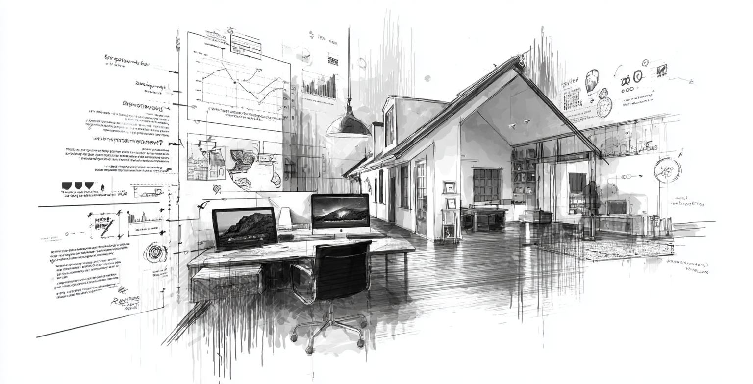
GYRO (Grow Your Remodel Outfit) is a growth platform built specifically for remodelers, design-build firms, and home-improvement brands that want steady demand without building a big marketing team. Your website is usually the first real “conversation” a homeowner has with your business—yet small issues in design, copy, and SEO quietly chase good leads away. This checklist walks through ten common remodeling website mistakes and how to fix them, so your site can start working like a true sales tool instead of a digital brochure.
Hidden Website Flaws That Cost Remodelers Leads
Most remodeling websites don’t fail because of one big problem—they underperform because of a dozen small ones. A weak headline here, a slow-loading gallery there, or a missing call-to-action can be enough for a homeowner to hit the back button and call someone else. The good news: these mistakes are fixable, and many of them can be improved with simple, practical changes.
This article focuses on four high-impact areas—headlines, mobile experience, calls-to-action, and load speed—plus six more issues that can quietly derail an otherwise solid site.
At a Glance: 10 Common Remodeling Website Mistakes
Use this as a quick checklist. If you recognize more than a few of these, it’s time for a focused website tune-up.
Your headline doesn’t clearly state who you serve or what type of remodeling you specialize in.
The site looks fine on a laptop, but breaks, shrinks, or feels clunky on mobile.
Pages end without telling visitors what to do next—no “Request a Consult,” “Get a Quote,” or next step.
Large photos and unoptimized scripts make pages sluggish, especially on mobile or older devices.
The site looks old, templated, or disconnected from the quality of your current projects.
Content could belong to any remodeler—no clear niche, service focus, or location emphasis.
Galleries lack before/after context, project details, or storytelling that helps homeowners imagine their own space.
Reviews, badges, guarantees, and process explanations are buried—or missing entirely.
Key pages like kitchens, bathrooms, and basements are hard to find, or buried under vague menu labels.
Pages aren’t structured for search, and you can’t see which visits turn into leads.
Design & Headline Mistakes (and How to Fix Them)
Your visuals and top-of-page messaging decide whether homeowners stay for 30 seconds or three minutes. If your design looks dated or your headline is vague, they may never even reach your portfolio or contact form.
Checklist for Headlines & First Impressions:
- Headline clarity: Does your homepage headline state your main service and service area (e.g., “Kitchen & Bathroom Remodeling for [City] Homeowners”)?
- Above-the-fold clarity: Can a new visitor tell what you do in 3–5 seconds without scrolling?
- Visual alignment: Do your photos and colors match your brand and the type of projects you want more of?
Fix weak headlines by using simple, specific language and pairing it with one strong project photo—not a rotating carousel of random images.
Mobile Experience, CTAs, and Speed
Most homeowners first encounter your brand on a phone. If your site is slow, cramped, or hard to use on mobile, they won’t fight with it—they’ll just move on. The same is true for weak calls-to-action and slow page loads.
-
Mistake 1: Weak or Vague Homepage Headline
Your headline says something like “Quality You Can Trust” instead of clearly stating the type of remodeling you do and where you do it.
Fix it: Rewrite your headline to include your main service and service area (for example, “Kitchen & Bath Remodeling for [Region] Homeowners”). Connect it to a supporting subheadline explaining your approach or differentiator. -
Mistake 2: Poor Mobile Experience
Buttons are tiny, text runs edge-to-edge, and galleries are tough to swipe through on a phone.
Fix it: Test every key page on a mobile device. Make sure navigation is simple, buttons are thumb-friendly, forms are short, and images resize cleanly. Prioritize vertical scrolling over side-by-side layouts that break on small screens. -
Mistake 3: Missing or Weak Calls-to-Action
Homeowners scroll through your content and reach the bottom of the page with no clear next step.
Fix it: Add a primary CTA to each key page (e.g., “Request a Consultation,” “Schedule a Call,” or “Tell Us About Your Project”), and repeat it mid-page and near the bottom so visitors have multiple chances to act. -
Mistake 4: Slow Load Speed
High-resolution images, uncompressed video, and unused scripts cause delays—especially on mobile or slower connections.
Fix it: Compress images, limit autoplay video, and remove plugins or scripts you’re not using. Prioritize loading above-the-fold content quickly so visitors can start engaging with the page while the rest loads.
Copy, Positioning, and Project Storytelling
Design brings homeowners in, but copy and project storytelling help them decide whether you’re the right fit. Thin or generic copy makes it hard for visitors to understand what’s unique about your firm.
|
Mistake 5: Outdated or Generic Design
Symptom: Your site looks older than your work, uses generic stock photos, or doesn’t match your in-home presentation.
Fix: Refresh your layout, typography, and color system so that your brand, trucks, proposals, and website all feel like the same modern company. |
|
Mistake 6: Thin, Generic Copy
Symptom: Your pages could describe almost any remodeler in your region.
Fix: Call out specific project types (kitchens, baths, basements), materials, and neighborhoods you work in. Speak directly to homeowner concerns like timelines, budgets, dust control, and communication. |
|
Mistake 7: Weak Project Showcases
Symptom: Your gallery is just a wall of images with no context.
Fix: Turn key projects into short case-style stories: what the space was like before, what the client wanted, what you designed and built, and the final outcome. |
|
Mistake 8: Missing Trust Signals
Symptom: Reviews and credentials are buried—or absent.
Fix: Add testimonials, star ratings, and badges near CTAs and hero sections. Include a simple overview of your process to reduce uncertainty for first-time remodelers. |
Navigation, SEO, and Measurement
Even a beautiful site can underperform if homeowners can’t find what they’re looking for—or if search engines can’t understand what you do. Without basic SEO and tracking in place, you’re guessing which pages actually drive leads.
-
Mistake 9: Confusing Navigation
Services are hidden behind vague menu labels (“Solutions,” “What We Do”) instead of clear options like “Kitchen Remodeling” or “Bathroom Remodeling.”
Fix it: Use straightforward navigation labels and ensure every major service has a dedicated page. From your menu, a homeowner should be able to get to kitchens, bathrooms, basements, and whole-home projects in one click. -
Mistake 10: No SEO or Tracking Foundation
Title tags, meta descriptions, headers, and internal links are unplanned—and you don’t have clear data on which pages generate inquiries.
Fix it: Ensure each page targets a clear topic, include your service area where appropriate, and link related pages together (e.g., from your homepage to “Kitchen Remodeling” to a kitchen gallery). Pair your website work with an SEO program like SEO & Organic Growth and connect your forms to analytics so you can see which visits become real leads.
How GYRO Helps Remodelers Fix These Mistakes
Most remodelers know their site could be better—but carving out time to rewrite copy, rework layouts, and align everything with SEO rarely makes it to the top of the list. GYRO changes that by pairing strategist guidance with an AI-powered content engine built specifically for remodelers.
Through programs like Website & Content and Website Design & Development, GYRO helps you:
- Clarify your messaging and headlines so homeowners instantly understand what you do.
- Modernize your layout, visuals, and mobile experience.
- Build or improve service pages for kitchens, bathrooms, basements, and more.
- Layer in trust signals, project storytelling, and clear CTAs.
- Align your content with SEO & Organic Growth so the right homeowners can actually find you.
Want a Quick Website Mistake Audit?
If you suspect your website is costing you good leads, GYRO can help you spot the most important fixes and prioritize what to do first. We review your homepage, service pages, CTAs, and basic SEO structure, then give you a clear, practical game plan.
Key Takeaways
Make Your Website Work as Hard as You Do
- Small website mistakes—weak headlines, clunky mobile layouts, slow pages, and missing CTAs—quietly push good leads away.
- Modern, on-brand design plus clear copy and project storytelling make it easier for homeowners to see themselves working with you.
- Simple navigation, SEO basics, and tracking turn your website into a measurable, improvable sales asset.
- With GYRO, you don’t have to fix everything alone—strategists and AI-powered tools help you upgrade faster and more systematically.
A few focused improvements can significantly increase how many visitors become inquiries. Treat this article as a checklist, make changes where you can, and bring in help where it saves you time and stress.
Next Step
Your website is often the first “walk-through” a homeowner takes with your business. If it feels outdated, confusing, or hard to use, they may never see your best work.
GYRO helps you fix that by aligning strategy, design, content, and SEO—so your website reflects the quality of your projects and the professionalism of your team.
Explore Website Design & Development Talk to a GYRO Strategist
We’ll review your current site, identify the mistakes that matter most, and map out a practical plan to turn your website into a consistent source of qualified remodeling leads.