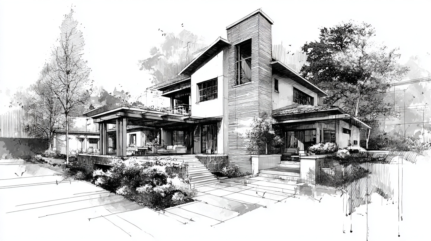
Iconography and custom graphics play an important role in how homeowners perceive a remodeling brand before they ever call, fill out a form, or request an estimate. While project photography often carries the emotional weight of a website, icons and supporting graphics help organize information, clarify services, reinforce brand identity, and make your marketing feel more polished and intentional.
For remodelers, that matters. Homeowners are making decisions about who to trust with a major investment. A brand that looks organized, clear, and thoughtfully designed often feels more established and more credible. Good iconography helps explain services, process steps, differentiators, and value points quickly. Custom graphics can also bring consistency to website content, presentations, social posts, and educational materials in a way that stock visuals often cannot.
In this guide, you will see why iconography and custom graphics matter, how remodelers can use them strategically, which tools and design principles help most, what mistakes to avoid, and how to build a practical system that strengthens marketing performance without adding unnecessary complexity.
Why Iconography and Custom Graphics Matter for Remodelers
Most remodeling websites rely heavily on text and photography. Both are important, but they do not always carry the full burden of communication efficiently. Icons and custom graphics help make information easier to scan, easier to understand, and easier to remember. They improve readability on service pages, help explain processes or offerings, and give the brand a more cohesive visual language.
This is especially useful in remodeling, where services can overlap and homeowner questions are often practical. A visitor may want to quickly understand whether you handle kitchens, baths, additions, design-build work, product selections, financing, or project management. When those ideas are supported by clean visual cues, the experience feels easier and more professional.
Strong iconography and custom graphics help remodelers in several important ways:
- They improve clarity: icons help simplify service categories, features, and process explanations.
- They strengthen brand consistency: custom graphics make the company feel more polished across website, presentations, and social content.
- They improve usability: visual cues make pages easier to scan and navigate.
- They support positioning: custom visual elements help communicate whether the brand feels premium, modern, practical, or design-forward.
- They reduce reliance on generic stock visuals: custom elements create a more ownable brand system.
When done well, iconography is not decoration. It is a communication tool. For GYRO, that matters because the strongest remodeler brands are the ones where messaging, layout, visuals, and conversion strategy all work together as part of one consistent growth system.
What Good Iconography Should Actually Do
Good icons do not just make a page look modern. They should help people understand information faster. That means icons need to be clear, recognizable, consistent in style, and relevant to the content they support. A custom graphic should also have a job. It may explain a process, highlight a service category, reinforce a feature, or support a visual hierarchy on the page.
For remodelers, effective iconography often appears in service overviews, process breakdowns, trust-building sections, FAQs, comparison charts, and resource pages. The goal is not to add visual noise. The goal is to make content easier to use and more aligned with the overall brand.
|
Clarity
Includes: simple shapes, easy recognition, limited visual complexity, and clear association with the content.
Why it matters: icons should make information easier to understand, not harder to decode. |
|
Consistency
Includes: matching stroke widths, corner treatments, proportions, spacing, and visual weight.
Why it matters: a consistent icon set makes the brand feel more professional and trustworthy. |
|
Relevance
Includes: icons and graphics that actually fit the message, audience, and remodeling context.
Why it matters: generic or confusing visuals weaken the value of the content they are meant to support. |
|
Scalability
Includes: designs that work well across websites, mobile screens, presentations, PDFs, and social graphics.
Why it matters: custom assets should stay useful across channels instead of needing constant redesign. |
The Core Structure of an Effective Iconography System
Most remodelers do not need dozens of elaborate illustrations. What they need is a small, practical visual system that supports their most important content. That system usually includes a few service icons, process icons, trust icons, comparison elements, and a small set of graphic treatments that can be reused across pages and campaigns.
When those elements are intentionally designed, they create a visual language that makes the brand more recognizable. Over time, that improves consistency across website pages, landing pages, educational content, proposals, and even social post templates.
A practical iconography formula for remodelers:
- Keep it simple: icons should communicate quickly at a glance.
- Make it consistent: use one visual style across the full set.
- Support the content: do not add icons where they do not improve clarity.
- Design for multiple uses: build elements that work on web pages, PDFs, decks, and social assets.
- Align with the brand: visual style should match how the company wants to be perceived.
Key Principle #1: Use Icons to Clarify, Not Decorate
One of the most common mistakes in website design is using icons only because a layout feels empty. That leads to visuals that look arbitrary and do not help the user. Strong iconography should support comprehension first. Every icon should earn its place by making the content easier to scan, understand, or remember.
For remodelers, this often means using icons to break down services, explain a process, summarize benefits, or guide the eye through a page. A service icon next to “Kitchen Remodeling” can improve scanability. A process icon next to “Design and Planning” can make a multi-step section easier to follow. But adding random house, hammer, or wrench icons everywhere usually adds visual clutter instead of value.
Why this principle matters: the best custom graphics reduce friction. They make complex information feel easier and help the brand look organized instead of overdesigned.
Where Icons Add the Most Value
|
Service Overviews
Use icons to help visitors quickly identify room types, specialties, or service categories.
|
|
Process Sections
Support multi-step explanations with simple visuals that improve flow and readability.
|
|
Feature Lists
Reinforce benefits like design support, project management, communication, warranties, or material guidance.
|
|
Educational Content
Add structure to guides, FAQs, and resource pages where content density may otherwise feel heavy.
|
When this principle is followed, icons feel purposeful. They support the content instead of competing with it. That makes the overall brand feel clearer and more professional, which is exactly what remodeling companies need when they are trying to earn trust quickly.
Key Principle #2: Consistency Makes the Brand Feel More Professional
A single good icon is not enough. If one icon is outlined, another is filled, another is highly detailed, and another comes from a different library entirely, the visual system feels fragmented. Homeowners may not describe that inconsistency in design terms, but they notice when a website feels more polished versus more pieced together.
Consistency matters because it affects perceived quality. A unified icon system makes the website feel better built. It supports professionalism in the same way consistent photography, typography, and layout do. The result is a brand that feels more trustworthy and more deliberate.
Elements that should stay consistent across an icon set:
- Stroke thickness
- Filled versus outlined style
- Corner radius and shape language
- Proportions and sizing
- Spacing and padding inside the icon frame
- Visual complexity and level of detail
Custom graphics should follow the same logic. If your diagrams, badges, callout boxes, and section graphics all feel visually related, your brand becomes easier to recognize and easier to trust across pages and channels.
Key Principle #3: Custom Graphics Should Reflect Your Positioning
Not every remodeler needs the same type of visual system. A premium design-build firm may want cleaner, more minimal, more refined custom graphics. A practical, family-focused remodeler may benefit from approachable and highly legible icons that emphasize clarity and trust. A design-forward brand may use more elevated layouts, subtle motion cues, and more sophisticated graphic treatments.
This matters because icons and custom graphics influence tone just like colors, fonts, and photography do. They can help a brand feel more modern, more technical, more upscale, more friendly, or more process-driven. The right direction depends on who you want to attract and how you want the company to be perceived.
Questions to Define Your Direction
-
What kind of projects do you want more of?
Your visual system should support the type of work and homeowner expectations you are trying to attract. -
How should the brand feel?
Modern, premium, practical, approachable, educational, or design-driven. -
What information needs better clarity?
Services, process, differentiators, benefits, FAQs, comparisons, or timelines. -
Where will these graphics be used most?
Website pages, lead magnets, proposal decks, social templates, ads, or all of the above.
Once those answers are clear, it becomes easier to design a set of visual tools that actually fits the brand and supports growth instead of simply filling empty space on a layout.
Key Principle #4: Different Assets Need Different Types of Graphics
Not every custom graphic serves the same purpose. A homepage feature section may need small icons that support fast scanning. A long-form educational article may benefit from process diagrams or comparison graphics. A proposal deck may need cleaner service badges and section dividers. Social posts may need graphic templates that make recurring content easier to brand consistently.
That is why an effective visual system includes usage rules. Remodelers should know what belongs on a website service page versus what belongs in a downloadable guide or an Instagram carousel. This keeps the brand consistent while allowing each channel to use graphics in a way that fits its purpose.
Helpful rule: do not build graphics just to make pages look busier. Build them to support how the user reads, compares, understands, and takes action.
Best Uses by Channel
- Homepage: simple feature icons, trust cues, and light graphic structure that improves scanning
- Service pages: room-specific or process-supporting icons that reinforce what the service includes
- Educational articles: diagrams, steps, comparison graphics, and visual section dividers
- Proposals and decks: process icons, section labels, and branded comparison visuals
- Social media: repeatable post graphics, educational slides, icon-supported tips, and branded visual templates
Tools, Process, and Real-World Execution
Remodelers do not need an overly complex design stack to build better iconography. What matters most is having a repeatable process. That starts with defining the use cases, choosing the right tools, building a style direction, and creating a small set of reusable assets before expanding further.
Tools like Adobe Illustrator and Figma are especially useful because they allow icons and vector graphics to stay crisp at different sizes. That matters when the same asset may appear on a mobile page, a website section, a PDF proposal, or a social template. Vector-based graphics also make it easier to update colors, scale elements, and keep the system consistent over time.
|
Adobe Illustrator
Useful for building polished custom icons, scalable vector graphics, and reusable brand assets with precise control.
|
|
Figma
Helpful for UI-aligned icon systems, quick prototyping, web layouts, and collaborative design workflows.
|
|
Icon Libraries
Can speed up workflow when used selectively, but should be curated carefully so the brand does not feel generic or inconsistent.
|
|
Brand Guidelines
A short standard for icon sizes, color use, spacing, and approved graphic treatments helps maintain consistency across future work.
|
In real-world execution, the most valuable approach is often to start small. Build the core set first: main services, process steps, trust cues, and a few reusable graphic elements. Then apply them consistently to the pages and materials that matter most for visibility and conversion.
Common Mistakes That Weaken Iconography and Custom Graphics
Most weak visual systems fail for predictable reasons. The issue is usually not that icons were used at all. The issue is that they were added without a clear purpose, without a consistent style, or without thinking about how they fit the broader brand system.
Important takeaway: the value of iconography comes from systems, not isolated design choices. A smaller, well-structured set of custom assets is usually more effective than a large collection of mismatched visuals.
How to Build an Iconography and Custom Graphics System Step by Step
You do not need to redesign your entire brand at once. Start with the places where better graphics will improve clarity and consistency the most, then build from there.
-
Clarify your brand direction
Define how the brand should feel and what type of homeowner experience your visuals should support. -
Audit your existing visual assets
Review pages, decks, PDFs, and social templates to identify inconsistencies and missing opportunities. -
Choose key use cases first
Prioritize service icons, process graphics, trust cues, and any supporting visuals used frequently. -
Set style rules
Define stroke width, shape language, color use, spacing, size standards, and how custom graphics should look overall. -
Build a small core library
Create the first set of icons and graphics that can be reused across your highest-value assets. -
Document and apply consistently
Use those visuals across the website, articles, proposals, and social templates so the brand compounds over time.
How GYRO Helps Remodelers Turn Better Visual Systems Into Better Growth
GYRO is built for remodelers who want consistent growth without having to build a large internal marketing team. That makes visual systems especially important. When iconography and custom graphics are done well, they improve how website content is consumed, how service pages convert, how social content feels branded, and how educational resources communicate value.
Instead of treating design elements as separate from strategy, GYRO helps remodelers connect visuals to business goals. Custom graphics can support clearer service messaging, stronger page structure, better conversion flow, and more consistent brand presentation across the assets that actually influence lead quality.
Where GYRO supports iconography and custom graphics execution:
- Website and Content: visual elements help structure information and improve conversion clarity.
- Branding and Identity: custom iconography supports a more distinctive and cohesive visual system.
- SEO and Organic Growth: stronger content presentation makes educational pages easier to use and more credible.
- Social Strategy and Calendars: reusable branded graphics make ongoing content production more consistent.
- Strategist oversight: design decisions stay tied to positioning, usability, and remodeler growth goals.
Explore Why GYRO, Branding and Identity, Website and Content, SEO and Organic Growth, and Resources to see how strong visual systems fit inside a complete remodeler marketing engine.
Conclusion: Better Visual Systems Help Remodelers Communicate More Clearly
The best iconography and custom graphics do more than improve appearance. They help remodelers explain services more clearly, make marketing assets easier to use, and build a more trustworthy brand presence across channels. In a category where clarity and confidence matter, that makes them far more than decorative details.
Whether you are refining your website, strengthening educational content, improving proposals, or creating more consistent social assets, a practical visual system can help your company feel more organized and more credible. That is valuable because homeowners often judge quality long before they reach out.
If your current brand relies on generic graphics, inconsistent icons, or text-heavy pages that feel harder to scan, developing a more intentional system is one of the simplest ways to improve clarity and polish without overcomplicating your marketing.
Want a Remodeler Brand That Looks More Clear, Consistent, and Professional?
GYRO helps remodelers build strategist-guided, AI-assisted marketing systems where visuals, messaging, SEO, and website structure work together to attract better-fit leads and support sustainable growth.
Key Takeaways
The Best Iconography and Custom Graphics Help Remodelers Look Clearer and More Credible
- Iconography and custom graphics improve clarity, usability, and visual consistency across remodeler marketing assets.
- Good icons should clarify information, not simply decorate layouts.
- Consistency in style, proportion, and usage makes the brand feel more professional and trustworthy.
- Custom graphics should reflect positioning and support the kinds of projects and clients a remodeler wants to attract.
- Different channels need different types of visuals, so usage strategy matters as much as design quality.
- Common mistakes include mixing icon styles, overcomplicating visuals, using graphics without purpose, and lacking standards.
- GYRO helps remodelers turn stronger visual systems into better websites, clearer messaging, and better-fit leads.
Better graphics make your brand easier to understand, easier to trust, and easier to choose.