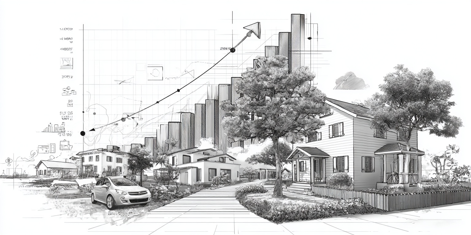
A remodeler website redesign should start with conversion fixes, not colors. Fix the message, structure, and lead flow first so more of the right homeowners book consults.
Most remodelers do not need a “prettier” website. They need a website that makes it obvious who they help, what projects they specialize in, and what the next step is for a homeowner who is ready to talk. A redesign that skips those basics usually creates more work and less lead growth because it rebuilds visuals on top of a weak foundation.
This remodeler website redesign checklist gives you a clear priority order. You will start with message clarity and service architecture, then tighten calls to action, trust proof, and portfolio UX. After that, you will handle mobile and speed, forms and tracking, and only then refresh the visual layer. That sequence prevents rework and protects your SEO while improving conversions.
Whether you are a single-location remodeler, a multi-crew contractor, or a growing design-build firm, the goal is the same: more qualified inquiries, higher close rates, and a smoother pipeline. If you want steady demand without building a big marketing team, this is the exact type of repeatable system GYRO helps you implement.
If you care about remodeler website redesign, contractor website checklist priorities, and remodeling website conversion fixes that turn traffic into booked consults, this guide is your practical playbook.
Why Remodeler Website Redesigns Fail (And How to Avoid It)
Most redesigns fail for one simple reason: they treat a contractor website like a brochure instead of a lead engine. Homeowners are not looking for “design vibes.” They are looking for confidence. They want to know you do their type of project, in their area, with a clear process, and proof that you can deliver.
- They start with visuals: A new theme and new photos cannot fix unclear positioning or weak page structure.
- They hide the specialty: If you want kitchens, baths, or design-build work, your site must make that obvious in seconds.
- They bury the next step: If your CTA is vague or inconsistent, good traffic leaves without contacting you.
- They forget trust proof: Remodeling is high-dollar and high-stress. No proof means no call.
- They break SEO by accident: A redesign that changes URLs or removes content can erase hard-earned rankings.
The fix is not more marketing. The fix is a better system. That is why this checklist starts with clarity and conversion fundamentals before you touch the visual layer.
If you want the broader context on how a remodeler website should function as a growth asset, start with Website Design and Development and the platform overview on GYRO Solutions. The goal is simple: steady demand, less marketing chaos.
The Remodeler Website Redesign Priority Order
A smart remodeler website redesign is not one big “make it new” project. It is a sequence of fixes that stack. Each step makes the next step easier, and each step reduces wasted traffic.
Redesign priority order that prevents rework:
- → Message clarity: who you help, what you do, and why you are the right choice.
- → Service architecture: pages and navigation built around the projects you want.
- → CTAs and lead flow: clear next steps on every high-intent page.
- → Trust proof: reviews, process, credentials, and real project outcomes.
- → Portfolio UX: projects organized to sell the work, not just show photos.
- → Speed and mobile: fast, stable pages that feel premium on a phone.
- → Forms and tracking: fewer dead leads, better data, cleaner follow-up.
- → Visual refresh: typography, spacing, and brand polish after the structure works.
If you do these in order, your remodeler website redesign becomes a lead growth project, not a design-only project.
Step 1: Fix Your Message Clarity First
Message clarity is the highest ROI fix on a remodeling website because it impacts every visitor, every page, and every marketing channel. If your message is fuzzy, your traffic becomes expensive, even if it is “free” organic traffic. Homeowners will bounce because they cannot quickly confirm you are a match.
What a remodeler homepage message must answer
|
Who
Answer: Who you serve and where (your service area).
Example: Homeowners in your metro and surrounding towns. |
|
What
Answer: The projects you are known for (kitchens, baths, basements, additions, design-build).
Goal: Attract the right projects and repel bad-fit work. |
|
Why you
Answer: Your differentiator in plain language (process, craftsmanship, design capability, communication, warranty, schedule discipline).
Tip: Keep it concrete, not generic. |
|
Next step
Answer: What the homeowner should do now (book a consult, request an estimate, see process).
Goal: Remove decision friction. |
When message clarity is right, homeowners feel oriented. They click deeper, they read your process, they view your projects, and they are more likely to submit a form because the website feels organized.
Quick “5-second” message test: If a homeowner lands on your homepage for 5 seconds, can they repeat back what you do and what to do next?
If the answer is no, do not start with a redesign. Start with message clarity and page structure.
Step 2: Rebuild Your Service Architecture Around the Jobs You Want
Service architecture means your navigation, your service pages, and the way your site routes homeowners to the right project path. This is one of the most important contractor website checklist items because it directly controls lead quality. If your site makes “everything” look equal, you will get a mix of leads you do not want.
How remodelers should think about service pages
Service pages are not a list of what you can do. They are decision pages. A good service page answers the homeowner’s questions in the order they naturally ask them: “Do you do my project?” “Do you do it near me?” “Can I trust you?” “How does your process work?” “What is the next step?”
If you want kitchens and baths, those deserve dedicated pages. A generic “Services” page makes every project feel the same.
Service pages should link to relevant project galleries, process content, and contact paths so homeowners do not get stuck.
Service area clarity belongs on service pages. Remodelers win when homeowners feel “they do this in my area.”
Do not make homeowners hunt for contact. Add a clear CTA, then repeat it after trust proof and project examples.
Service architecture checklist (simple version):
- → Do you have a page for each high-profit service you want more of?
- → Does each page include proof (projects, reviews, process, credentials)?
- → Does each page include a clear next step (consult, estimate request, call)?
- → Are these pages easy to find in navigation and internal links?
- → Does the language match how homeowners search and talk?
This is where GYRO’s strategist-guided approach helps: you build the right page map first, then the content engine fills it with compounding visibility.
Step 3: Fix Calls to Action and Lead Flow
CTAs are the “handles” on your website. They tell homeowners what to do next, and they make the next step feel normal. Without strong CTAs, even high-intent visitors leave because they are not sure how to engage.
What “good CTA” means for remodeling sites
A remodeler CTA should be:
- Specific: “Schedule a Design Consultation” beats “Contact Us.”
- Low-friction: Offer a clear first step, not a commitment-heavy promise.
- Repeated: Place CTAs where homeowners decide, not only in the header.
- Consistent: Use the same primary CTA across pages so the site feels coherent.
The goal is not more CTAs. The goal is a cleaner path to the next step.
Use one primary CTA and one secondary CTA
Most remodeling sites get messy because they add too many options: call, email, quote, download, chat, financing, newsletter. Pick a primary CTA that matches your sales process (often a consult) and a secondary CTA for homeowners who are not ready (often “see process” or “view projects”).
-
Pick the primary action you want most visitors to take
A consult request, estimate request, or showroom visit. Make it your main header button and your primary CTA across service pages. -
Pick a secondary action for research-stage visitors
“View our process” or “See recent projects” keeps the visitor moving and builds trust before the form. -
Match CTAs to intent
High-intent pages (service pages, pricing expectations, project pages) should push consult. Low-intent pages (blogs, guides) can push resources or process. -
Remove friction
If your form is long or confusing, CTA improvements will not matter. Fix the form and follow-up workflow.
Step 4: Strengthen Trust Proof (The Stuff That Actually Sells Remodeling)
Homeowners do not book a remodeler because the site looks modern. They book because they trust the outcome. Trust proof is everything that reduces risk in the homeowner’s mind: reviews, credentials, process clarity, clean photography, and evidence that you have solved similar projects before.
Trust proof that moves the needle
Use a few strong review highlights near CTAs, then provide a deeper review hub or credibility section where appropriate.
Homeowners want to know what happens after they reach out. A simple process section removes anxiety and increases form submissions.
“Kitchen remodel” photos are not enough. Show before and after, constraints, solutions, and outcomes so your portfolio feels real.
Short team bios and a clear communication model can increase trust for design-build and higher ticket work.
|
Where trust proof belongs
Homepage: Proof near the top and near the primary CTA.
Service pages: Proof tied to that specific service type. Project pages: Proof inside the story, not only at the end. About page: Proof of credibility, not a life story. |
|
What to avoid
Avoid: Generic “quality craftsmanship” claims with no evidence.
Better: Specific outcomes, clear process, and visual proof. |
Step 5: Fix Portfolio UX So Projects Sell (Not Just Sit There)
A remodeler portfolio is not a gallery for other remodelers. It is a decision tool for homeowners. That means the portfolio must be organized, scannable, and connected to services. If your projects are hard to browse, homeowners will leave even if the work is great.
Portfolio UX checklist
Portfolio improvements that create lead growth:
- → Group projects by project type (kitchens, baths, basements, exteriors) so homeowners can self-select.
- → Add short project context (scope, goals, constraints, outcome) so the work feels credible.
- → Add “related next steps” under each project: link to the matching service page and your consult CTA.
- → Prioritize the best projects, not all projects. Too many weak projects lowers perceived quality.
- → Use consistent photography sizing and a clean grid so the site feels premium.
The goal is a portfolio that increases confidence and makes it easy to take the next step.
Step 6: Speed and Mobile (Because Most Homeowners Will Judge You on a Phone)
Speed and mobile experience are not technical “extras.” They are part of trust. If your website feels slow, broken, or jumpy on a phone, homeowners subconsciously assume your process might feel the same. A fast, stable site feels organized and professional.
Mobile and speed fixes that matter most
Large uncompressed images are the most common reason remodeler sites feel slow. Optimize images before you rebuild pages.
Each extra tool can add load time and instability. Keep only what supports lead flow and measurement.
Typography, spacing, and consistent components reduce “visual jitter” and make the site feel more premium.
Buttons should be clear, large enough, and not hidden under sticky elements that block content.
Simple remodeler mobile test: Open your top service page on your phone. If it takes longer than a few seconds to load, or if you have to pinch and zoom to read, speed and mobile are redesign priorities.
Fixing speed and mobile after a visual redesign is expensive. Fix it while you rebuild structure and content.
Step 7: Forms and Tracking (Stop Losing Good Leads)
If your remodeler website redesign improves everything except the form and follow-up, you will still leak revenue. Forms are where intent becomes a lead. Tracking is how you learn what is working, so you can do more of it without guessing.
Form fixes that improve lead quality
|
Keep forms short
Rule: Only ask what you truly need to start a conversation.
Better: Name, email/phone, project type, location, and a short message. |
|
Add polite qualification
Goal: Filter out bad-fit leads without sounding harsh.
Examples: Service area confirmation, project type selection, or a soft budget range. |
|
Confirm next steps
Must-have: A clear message after submit that sets expectations.
Example: “We respond within X business days. Here is what happens next.” |
|
Track what matters
Track: Form submissions, call clicks, consult bookings, and which pages drove those actions.
Outcome: You can invest in what works and stop paying for what does not. |
Basic tracking checklist for remodelers:
- → Track primary conversions (form submits, phone clicks, consult bookings).
- → Track which service pages and project pages create leads.
- → Track traffic sources at a high level (organic, referral, paid, social).
- → Make sure you can measure changes after the redesign.
- → Keep it simple. The goal is better decisions, not complicated dashboards.
Tracking is how a remodeler website redesign becomes a compounding growth asset.
Step 8: Only Now Do the Visual Refresh
This is where most remodelers start, and it is why they end up disappointed. Visual refresh is important, but it should sit on top of a clear message, strong structure, and a clean lead path. When you do it last, it becomes cheaper, faster, and more effective.
What “visual refresh” should actually include
Headings should guide scanning. Body text should be easy to read. Good type improves perceived quality instantly.
Consistent spacing and clean sections make the site feel organized, which increases trust.
Buttons should look like actions, not links. The primary CTA should stand out without screaming.
Use consistent image sizes, strong hero images, and avoid clutter. Photography is part of credibility for remodelers.
Visual refresh rule: If you cannot explain your value in one clear sentence and route a homeowner to a clear next step, visual polish will not fix the conversion problem.
Make the site work first. Make it beautiful second.
Redesign Without Breaking SEO (The Contractor Website Checklist Most People Ignore)
SEO is often the silent casualty of a remodeler website redesign. A new design can accidentally remove content, change URLs, or break internal linking. That is how remodelers lose rankings and wonder why leads slowed down after a “big upgrade.”
SEO protection checklist during a redesign:
- → Keep important URLs the same when possible, especially service pages and ranking blog posts.
- → If URLs must change, set up proper redirects so search engines and homeowners land in the right place.
- → Do not delete high-performing content without a replacement plan.
- → Maintain clear headings and page structure so content stays understandable.
- → Preserve internal linking so authority still flows to your money pages.
This is one of the biggest reasons remodelers choose a system like GYRO: strategist oversight protects the foundation while the content engine builds compounding visibility.
How GYRO Helps Remodelers Redesign for Lead Growth Without Adding Marketing Overhead
GYRO is a growth platform built for remodelers and home-improvement brands that want steady demand without building a big marketing team. A remodeler website redesign is not just a design project in this system. It is a growth project with a clear operating model.
How GYRO supports remodeler website redesign outcomes:
- Strategist oversight: Clear priorities, correct sequencing, and fewer false starts.
- AI-powered content engine: SEO-aligned articles, reels, and pages that compound rankings over time.
- Conversion-first structure: Service architecture, CTAs, proof, and portfolio UX built to convert the right projects.
- Consistency without chaos: A repeatable system that does not require a big internal marketing team.
If you want to see how this works in a practical way, explore Why GYRO and Website Design and Development.
Want a Remodeler Website Redesign That Actually Grows Leads?
A redesign should not just look better. It should book more of the right consults.
If you want a clear priority plan and a growth system that compounds over time, talk with a GYRO strategist and map the fixes that will move the needle first.
Key Takeaways
Remodeler Website Redesign Checklist: Fix the Engine Before the Paint
- Start with message clarity so homeowners instantly understand your specialty and next step.
- Rebuild service architecture around the projects you want more of, not a generic services list.
- Make CTAs consistent and low-friction, then remove lead form friction that kills good intent.
- Add trust proof where homeowners decide: services, projects, and near primary CTAs.
- Improve portfolio UX so projects sell the outcome and route visitors into consult paths.
- Fix speed and mobile early because that is where most homeowners judge you.
- Protect SEO with URL stability, redirects, and a content preservation plan.
- Only after the structure works should you do the visual refresh.
When you follow the right sequence, your redesign becomes a compounding lead asset that attracts better projects and makes your pipeline easier to manage.