Before a homeowner ever speaks to your team, they see your brand. Your logo on a truck, your colors on Instagram, your project photos on the website all of it tells a story about what it’s like to work with you.
When that visual identity is consistent, homeowners recognize you faster, remember you longer, and feel more confident reaching out. When it’s inconsistent, they feel unsure: “Is this the same company I saw on Google?”
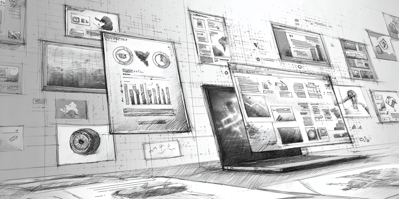
At GYRO (Grow Your Remodel Outfit), we help remodelers, design-build firms, and home-improvement brands turn scattered visuals into a clear, repeatable identity system. Our strategist-guided, AI-assisted content engine keeps your colors, fonts, logo usage, and imagery aligned across your website, Google Business Profile, social feeds, and print pieces so your brand looks like it’s coming from one trusted, established company not a different designer every month.
Why a Consistent Visual Identity Matters So Much for Remodelers
A clean, consistent visual identity isn’t just “nice design.” For remodelers, it directly impacts trust, lead quality, and how often you’re remembered when someone is finally ready to start a project.
Consistent visual identity helps you:
- Build instant recognition: The same colors, logo, and style across your trucks, yard signs, website, and social channels make it easy for homeowners to connect the dots.
- Signal professionalism: Polished visuals tell people you’re organized and detail-focused the traits they want in someone tearing apart their kitchen or bathroom.
- Attract the right projects: A refined, design-forward identity draws clients who value aesthetics and are willing to pay for higher-end work.
- Stand out from “generic contractors”: In a sea of similar names and services, a clear visual identity makes you feel like a brand, not just another bid.
In short: visual consistency makes your company feel established, thoughtful, and trustworthy before anyone ever reads a line of copy.
The Building Blocks of a Strong Remodeling Brand Visual Identity
A “visual identity” is more than just your logo. It’s the full system of elements that work together across every touchpoint. When the system is clear and documented, your brand looks consistent whether a strategist, designer, or AI tool is producing the asset.
1. Color Palette That Matches Your Positioning
Color is usually the first thing people notice. For remodelers, your palette should align with the types of projects you want more of and the emotional response you want to create.
- High-end, design-focused: Muted, sophisticated neutrals with one strong accent (deep green, navy, charcoal, brass-inspired tones).
- Family-friendly and approachable: Slightly warmer neutrals with soft accent colors that feel inviting rather than stark.
- Bold, modern remodeler: Strong contrast (dark + light) with one or two bold accent colors used sparingly for CTAs and highlights.
GYRO helps you document a primary and secondary palette and then uses those colors across web layouts, social templates, and call-to-action sections so everything looks like it belongs together.
2. Typography That’s Clean and Legible
Your typography should make your brand feel intentional even in a quick scroll. You don’t need a dozen fonts; you need a simple, flexible set:
- One headline font (used on web headings, ad headlines, and social titles).
- One body font (for paragraphs, captions, and supporting text).
- Clear rules for sizes, spacing, and capitalization (e.g., title case vs. all caps for headings).
Once those rules are set, GYRO can consistently apply them across blog graphics, project covers, and page layouts so “visual identity remodelers” is more than a keyword it’s a standard your team follows.
3. Logo System With Variations That Actually Get Used
Most remodeling brands need more than one logo file. You need a logo system that covers different spaces and backgrounds:
- Primary horizontal logo (for your website header and truck wraps).
- Stacked or centered version (for print materials, proposals, and some social uses).
- Simple brand mark or monogram (for social avatars, favicons, and tight spaces).
Inside a GYRO-led Logo and Visual Systems project, we don’t just design a nice logo we define where and how each variation should be used, then apply those rules in your content engine.
4. Imagery and Photography Style
Your project photos are your proof. A consistent visual identity includes standards for:
- How projects are shot (angles, lighting, focus on details vs. wide shots).
- Whether you use people in shots or only clean, staged rooms.
- How you edit photos (brightness, warmth, contrast, crop ratios).
- How you combine photos with overlays, logos, or text in social graphics.
GYRO uses these standards to guide project galleries, before/after photos, and case study designs, so your portfolio looks intentional instead of random.
Turn Your Visual Rules Into Simple Brand Guidelines
Once you’ve made decisions about colors, type, logos, and imagery, the next step is to document them in practical brand guidelines your whole team and partners can follow.
-
Capture your core brand basics
Document your logo files, color codes (HEX, RGB, CMYK), font names, and basic usage rules. This becomes the quick-reference “brand basics” page. -
Show real examples, not just theory
Include sample web sections, social posts, and project covers that demonstrate brand consistency. People copy examples more reliably than abstract rules. -
Define do’s and don’ts
Note what should never happen: stretched logos, off-brand colors, mixing random fonts, inconsistent icon styles, etc. -
Make it easy to share
Store your brand guidelines and key files in one place. GYRO’s strategist can plug them into your content program so every asset follows the same standards.
Make Consistency Easy With Templates and Systems
Most “brand consistency” problems don’t come from bad intentions they come from people improvising under time pressure. Templates turn brand consistency into the default.
Helpful visual templates for contractor branding:
- Website sections: Reusable layouts for service pages, project spotlights, and CTAs that use the same spacing, button styles, and headings.
- Social graphics: Story and feed templates for project reveals, client testimonials, tips, and “in-progress” updates.
- Proposal + document covers: Branded covers and section headers for estimates, scopes of work, and design presentations.
- Physical touchpoints: Yard signs, vehicle wraps, uniforms, and print leave-behinds that reuse the same color, logo, and typography system.
In GYRO, these templates are tied into your content engine so every blog thumbnail, reel cover, and resource download reinforces the same visual identity.
Bringing Your Visual Identity Online and Offline
Brand consistency isn’t just digital. Homeowners notice whether your offline and online touchpoints look like they’re coming from the same company.
Use your core palette, fonts, and logo rules throughout your site. Service pages, project portfolios, and CTAs should all feel like one brand, not separate mini-sites.
Upload on-brand project photos, keep your logo consistent, and reuse the same visual style you use on your website. This supports both GBP optimization and brand recall.
Your blog and content strategy and your social calendars should share a look and feel. That way, a homeowner moving from Instagram to your site experiences one unified brand.
Vehicle wraps, yard signs, and leave-behinds should follow the same logo, color, and type rules. When neighbors search your name after seeing your sign, your website should look exactly like what they just saw outside.
Rebranding or Tightening Up an Existing Remodeling Brand
Maybe you already have a logo and website, but things feel messy. Your Instagram looks different from your trucks, and your proposals look different from everything else. You don’t necessarily need to start from zero.
GYRO often helps remodelers with a “brand clean-up” and tightening process before we plug them into long-term content and SEO programs:
- Audit how your brand appears across web, social, GBP, print, and signage.
- Decide what to keep (recognition assets) and what to refine (colors, type, hierarchy).
- Create updated brand guidelines that keep the spirit of your current brand but raise the quality bar.
- Roll the new standards into your messaging and positioning, so visuals and words match.
Ready to Make Your Remodeling Brand Look as Good as Your Work?
If your projects are high quality but your visuals feel scattered, it’s time to bring everything into one clear system. GYRO can help you define your visual identity, document it in brand guidelines, and apply it consistently across your website, content, and marketing.
Key Takeaways
Make Visual Consistency a Non-Negotiable
- Homeowners notice whether your brand looks consistent across trucks, website, social, and print before they ever read your copy.
- A strong visual identity is built on clear decisions about color, typography, logo systems, and imagery style.
- Simple brand guidelines and templates turn “brand consistency” into a repeatable habit, not a one-time project.
- Online and offline touchpoints should feel like one cohesive remodeling brand, not a patchwork of styles.
- GYRO pairs strategist guidance with an AI-powered content engine so your brand identity stays consistent as you scale content, SEO, and social.
You don’t have to reinvent your brand overnight. Start by clarifying your visual basics, then apply them consistently to the pages and channels that drive your best projects.
Next Steps: Put Brand Consistency on a Schedule
Brand consistency becomes easier when you treat it like a system, not an occasional clean-up task. Many remodelers find it helpful to:
- Review brand visuals quarterly across website, GBP, and key social channels.
- Update templates and brand guidelines as you refine your ideal client and service focus.
- Align new campaigns and offers with your established visual identity instead of starting from scratch.
GYRO can lead this process as part of your broader growth program, tying visual identity into content strategy, SEO, and social media so everything pulls in the same direction.