
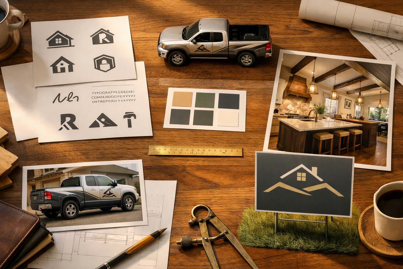
Does Your Remodeler Logo Say Premium Work or Commodity Contractor?
Your remodeler logo should support trust, project quality, and premium positioning. Learn when a visual identity refresh may be worth considering.
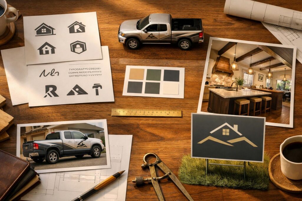
Remodeler logo design and brand fit
Does your logo look as capable beside your best project as the crew and the finished work actually are?
Across the U.S., a logo cannot turn commodity work into premium work. It can, however, make a strong remodeling outfit look interchangeable, difficult to read, or inconsistent when it fails on the website, proposal, truck, sign, workwear, social avatar, and project photography. The real question is whether the visual identity supports the position you can prove.
Here is what I would test: readability, distinction, category fit, typography, color, hierarchy, responsive versions, one-color use, real-world application, and consistency. Then I would decide whether the outfit needs cleaner deployment, a focused logo refresh, or a broader rebrand. Do not spend rebrand money to solve a file-management problem.
Can a logo affect how clearly homeowners understand your positioning?
Yes—but not in the way most logo sales pitches frame it. The logo does not create craftsmanship, communication, design judgment, project management, or client experience. Those qualities come from the outfit and the proof it can show.
The logo affects how that proof is introduced and organized. It can make the company name easy or hard to read. It can help the website, proposal, truck, and sign feel connected. It can create a recognizable signature beside project photography. It can also pull attention away from the work when the lockup is crowded, the icon is generic, or the style fights the desired project position.
Think of the identity as a framing system. A clean frame does not improve the project inside it, but a poor frame can make the viewer work harder to understand what they are seeing. That is why remodeler logo design should be reviewed beside the real homeowner decision path rather than on an isolated mockup.
Start with the business position:
- Which project types does the outfit want on the job schedule?
- Which homeowners or professional partners need to trust it?
- Is the business construction-led, design-led, or design-build?
- Which proof makes the position credible?
- Which traits should the visual system support without claiming them as facts?
A logo that fits a restoration carpenter may not fit a contemporary design-build firm. A mark built for a local trade vehicle may need different applications from an architecture studio identity. There is no universal “premium” style.
Straight talk: the logo should help the right person recognize and remember the outfit. It cannot do the job of project proof, process, reviews, or a clear proposal.
What should a premium remodeler logo communicate—and what can’t it prove?
A useful identity can communicate organization, clarity, confidence, category fit, and attention to application. Those are perceptions created by the relationship among the name, type, symbol, spacing, color, photography, and surrounding message.
I would look for six practical qualities:
The company is readable before the symbol is admired
Homeowners should not have to decode a thin script, tiny descriptor, or compressed lockup to understand who is behind the truck, sign, proposal, or website.
The style fits the real offer
Type, color, and shape can support a grounded builder, a design-led studio, a specialty trade, or an architecture practice without pretending the work is something else.
The mark is not dependent on a familiar contractor symbol
A roofline, hammer, house outline, or monogram is not automatically wrong. The question is whether the full identity becomes easy to confuse with nearby businesses.
The system survives different spaces
Horizontal, stacked, icon, one-color, light-background, and dark-background versions should be deliberate rather than improvised by each vendor.
Spacing, type, color, and photography work together
The identity should guide attention to the company, project proof, and next step instead of competing with every element on the page.
The same outfit appears at every touchpoint
The website, proposal, vehicle, sign, workwear, social profile, and project board should not use unrelated marks, colors, or slogans.
The logo cannot prove that the company does premium work, completes projects on a specific schedule, has a particular close rate, communicates well, uses superior materials, or produces larger projects. Those are claims that need evidence.
The FTC’s business guidance requires public advertising claims to be truthful, not deceptive or unfair, and supported by evidence. Do not use a polished identity to wrap unsupported claims about awards, credentials, experience, sustainability, warranties, project results, or guarantees.
Connect the visual system to the broader messaging and positioning. The words define the promise and fit. The visuals help the homeowner recognize the promise across touchpoints.
Which logo problems can make a contractor harder to distinguish?
Commodity is a market-positioning judgment, not a design diagnosis. A familiar symbol does not prove low-quality work, and a minimalist wordmark does not prove high-quality work. Use the following cues as questions, not verdicts.
Interchangeable symbols. Rooflines, houses, tools, mountains, and construction monograms are common because they quickly suggest a category. The problem appears when the symbol, name, type, and color create no distinction from several other outfits in the same local search market.
Crowded lockups. A company name, long descriptor, license line, slogan, founding year, phone number, and several icons may work on a large sign but collapse in a website header or social avatar. The logo should not carry every sales message.
Illegible typography. Thin strokes, compressed letters, ornate scripts, tight spacing, or tiny descriptors can disappear on mobile, embroidery, vinyl, and distance viewing. A type choice can look refined at presentation size and fail in use.
Too many effects. Bevels, shadows, outlines, gradients, textures, and multiple colors can make reproduction unpredictable. Effects are not automatically unprofessional; the question is whether they help recognition or create a different logo in every application.
No responsive system. A wide logo may be fine on a truck door and impossible in a square avatar. Without an approved icon or compact version, vendors crop the mark, remove words, or rebuild it from memory.
Inconsistent files. The company may have several “official” logos: an old JPEG, a different-color PDF, a vehicle version, a social icon, and a proposal mark. When no one knows which file is current, inconsistency becomes the brand.
Identity disconnected from proof. A formal, architecture-led mark paired with casual phone photos and generic copy creates a different problem than the logo alone. Review the entire branding system, not only the symbol.
Run a recognition audit, not a beauty contest
Do not ask a room of people which logo they like best without giving them the business context. Personal taste can produce strong opinions and weak decisions. The better test is whether the identity helps the right audience identify the firm, distinguish it from nearby options, and connect it to the project proof.
Place the current mark beside a small set of real local search and jobsite contexts, but do not turn the review into an unsupported competitor ranking. Look for repeated category cues, similar colors, nearly identical roofline shapes, comparable initials, and confusing company names. The point is to understand recognition risk, not declare that another company performs better.
Then test recall. Show the identity briefly in the context of a proposal cover, truck, or project image. Ask what company name, project category, and impression the viewer remembers. Record the language without leading the answer. A small first-party test cannot prove market-wide perception, but it can reveal whether the name disappears behind the symbol or the visual direction conflicts with the intended position.
Use the findings as evidence for a focused change. If people cannot read the descriptor, remove or resize it in small applications. If the icon is confused with several local marks, explore distinction. If the name is clear and the system feels disciplined, keep that equity instead of redesigning for novelty.
How should the identity work across trucks, signs, websites, proposals, and project photos?
A logo review is incomplete until the mark is placed where a homeowner actually sees it. A presentation board can hide problems that appear immediately on a mobile header, yard sign, truck door, or proposal cover.
| Touchpoint | Primary job | Stress test | Common failure |
|---|---|---|---|
| Mobile website header | Identify the firm without taking over the screen. | Can the name be read at the real header size on a small device? | Wide lockup, tiny descriptor, weak contrast, or no compact version. |
| Social avatar | Create a recognizable signature in a small square or circle. | Does the approved icon remain distinct without adding new letters or cropping the master mark? | The full logo becomes unreadable or the platform uses an unofficial symbol. |
| Truck or trailer | Identify the business from realistic distance and movement. | Can the company name and essential information be understood without packing the vehicle with copy? | Decorative type, low contrast, too many messages, or separate designs by vehicle. |
| Yard or jobsite sign | Identify the company in a residential environment. | Does the hierarchy work in bright light, at distance, and with limited viewing time? | Phone, URL, slogan, and services compete equally with the name. |
| Proposal cover | Frame the project, company, and next decision. | Does the logo support the project name, photograph, and proposal hierarchy? | The mark is oversized while the project and scope feel secondary. |
| Project photography | Connect proof to the firm without obscuring the work. | Does the brand treatment preserve the photograph and use accurate captions or credits? | Large watermarks, unrelated graphic overlays, or a logo style that fights the imagery. |
| Workwear and embroidery | Create consistent identification at human scale. | Does a simplified one-color version reproduce clearly in the actual material? | Tiny details fill in, colors shift, or a vendor redraws the mark. |
| Presentation boards and samples | Organize selections, plans, or project information. | Do typography, labels, color, and the mark create a clear information hierarchy? | The logo is correct but the rest of the system looks unrelated. |
Use real project photography in the test. A mark that looks sophisticated on a blank cream background may disappear on a warm wood kitchen, dark exterior, stone texture, or active jobsite image. Build approved background treatments rather than adding a random box or outline each time.
For a design-build firm, the proposal and website may need to carry both design judgment and construction capability. The identity should not lean so far toward one side that the other becomes unclear. The answer may be messaging and photography, not a new logo.
What should you test for legibility, hierarchy, color, and consistency?
Run the current system through practical tests before deciding it has failed.
- Small-size test: place the logo at the actual mobile-header and social-avatar size. Do not judge it only on a large presentation page.
- Distance test: print or mock up the truck and sign at realistic viewing conditions. Step back. Can the company name be understood before the details disappear?
- One-color test: reproduce the identity in one dark and one light color. This reveals whether the form depends on effects or subtle color differences.
- Background test: place approved versions on light, dark, photographic, wood, stone, and other common project contexts.
- Hierarchy test: review the logo with the project image, headline, proof, and CTA. What does the eye see first, second, and third?
- Consistency test: collect the website, proposal, truck, sign, social profile, email signature, workwear, and project board. Count versions and unexplained deviations.
- Content-fit test: compare the identity with the actual project mix and message. Does it support the current business or a version the outfit outgrew?
W3C’s basic contrast guidance notes that its specific text-contrast requirement does not apply to logos. That does not mean contrast is irrelevant to brand use. The surrounding website text, buttons, links, captions, forms, and text placed on images still need usable color pairings and identifiable interaction states.
NN/g’s visual-hierarchy guidance starts with the order of importance, then uses contrast, scale, grouping, and spacing to express that order. Apply that to the full homeowner touchpoint. A larger logo is not automatically a clearer hierarchy. Sometimes the project name, proof, or next step needs more attention.
Source basis: The FTC’s advertising guidance requires truthful, evidence-based claims around the identity. W3C’s designing-for-accessibility guidance covers surrounding contrast, non-color cues, identifiable controls, and responsive design while noting that its basic text-contrast requirement excludes logos. NN/g’s visual hierarchy guidance emphasizes contrast, scale, grouping, and spacing. None of these sources says a logo change guarantees premium leads, fees, project size, or SEO results.
Do you need a logo refresh or a full rebrand?
Start by naming the actual problem. A refresh solves execution and usability issues while preserving the recognizable identity. A rebrand addresses a deeper change in the business.
The master identity is sound
Fix file versions, spacing, color values, vendor assets, website use, proposal templates, and application rules. The problem is inconsistency, not the mark.
The position still fits but the identity struggles in use
Improve legibility, simplify effects, refine typography or spacing, create responsive versions, build one-color files, and clarify the visual system without discarding recognition.
The audience, offer, name, or desired project mix changed
Revisit positioning, messaging, name, identity, photography, website, proposals, and rollout as one business decision. Do not start with a symbol before the new position is clear.
A logo refresh may be enough when the company name is strong, the desired audience recognizes it, and the core visual idea still fits. The system may simply need better files and applications.
A broader rebrand may be worth considering when the outfit has changed from small trade work to whole-home design-build projects, merged companies, changed names, entered a new market, shifted from construction-only to integrated design, or cannot explain the current position without contradicting the identity. These are diagnostic examples, not automatic triggers.
Do not assume a rebrand will improve SEO or lead quality. Google’s people-first guidance supports clear audience, purpose, first-hand expertise, and factual accuracy; it does not identify logo design as a ranking factor. Any lead-quality or project-value result would require the outfit’s own data.
Once the direction is selected, document it through brand guidelines. Without application rules, the refreshed identity will begin drifting as soon as new vendors and employees use it.
The refresh-versus-rebrand rule
If the business position is right and the identity fails in application, refresh the system. If the business position itself changed, define the new position before redesigning the mark.
What should you send before a practical brand-fit review?
Do not send only the logo file. The mark needs context. Assemble the touchpoints a homeowner actually sees:
- The current primary logo and every version in active use.
- Vector files, raster files, color values, and any existing usage notes.
- The live website, including mobile header and service pages.
- One current proposal cover and a few representative interior pages.
- Truck, trailer, yard-sign, jobsite-sign, workwear, and presentation-board photographs.
- Social profile and recent project posts.
- Real project photography representing the work the outfit wants.
- The current project types, service area, delivery model, and positioning statement.
Then identify the business question. Are you trying to improve readability, look more consistent, move into different project categories, support a new name, prepare for a website rebuild, or reduce vendor guesswork? The answer changes the scope of the review.
I would separate findings into three groups: keep, refresh, and rethink. Keep recognizable parts that still work. Refresh the applications or details that create friction. Rethink only the elements that conflict with the current business position.
Frequently asked questions
What makes a remodeler logo look professional rather than generic?
Clear typography, disciplined spacing, useful versions, consistent application, category fit, and distinction in the local context can support a professional impression. No single symbol, font, or color universally creates it.
Does a premium remodeler brand need a luxury-looking logo?
No. The identity should fit the firm’s real projects, audience, process, proof, and personality. A luxury cliché can feel disconnected from a grounded builder or active jobsite.
Should my contractor logo include a house, roofline, hammer, or tool?
It can, but test whether the full identity remains distinctive, readable, and relevant. A familiar symbol becomes a problem when it makes the outfit easy to confuse with competitors or fails at practical sizes.
How do I know whether my logo needs a refresh or a full rebrand?
Refresh when the core position and recognition still fit but the mark needs better legibility, files, versions, or applications. Rebrand when the name, audience, offer, promise, or desired project mix has changed.
What logo files and versions should a remodeling company have?
Typically, the system needs approved vector and raster files, horizontal and stacked options, a compact icon where appropriate, one-color versions, light- and dark-background versions, and documented color and spacing rules. The exact set depends on the touchpoints.
Can changing my logo improve SEO or lead quality?
No verified source establishes logo design as a direct Google ranking factor or guarantees better leads. A clearer, more consistent identity may support the customer experience, but outcomes require first-party measurement.
Review the identity beside the work
Does your visual system look like the project quality you want your next client to trust?
Send your current logo, website, proposal cover, and truck or signage photos. I’ll take a practical look at readability, hierarchy, category fit, versions, and deployment—and tell you what I would keep, refresh, or rethink for a U.S. remodeling outfit. No pitch.